Difference between revisions of "Team:Cambridge-JIC/Wiki Design"
Simonhkswan (Talk | contribs) |
Simonhkswan (Talk | contribs) |
||
| Line 1: | Line 1: | ||
{{:Team:Cambridge-JIC/Templates/Menu}} | {{:Team:Cambridge-JIC/Templates/Menu}} | ||
<html> | <html> | ||
| + | <style> | ||
| + | img | ||
| + | { | ||
| + | filter: grayscale(1); | ||
| + | -webkit-filter: grayscale(1); | ||
| + | -moz-filter: grayscale(1); | ||
| + | -o-filter: grayscale(1); | ||
| + | -ms-filter: grayscale(1); | ||
| + | } | ||
| + | img:hover | ||
| + | { | ||
| + | filter: grayscale(0); | ||
| + | -webkit-filter: grayscale(0); | ||
| + | -moz-filter: grayscale(0); | ||
| + | -o-filter: grayscale(0); | ||
| + | -ms-filter: grayscale(0); | ||
| + | } | ||
| + | </style> | ||
<section style="background-color:#fff"> | <section style="background-color:#fff"> | ||
Revision as of 18:49, 18 September 2015
Graphic Design
Colours
Before creating too many images and colouring in your wiki, deciding on a colour scheme can ensure your wiki looks professional. Colours in HTML are given as RGB values. These can be difficult to visualise and match. Instead pick your colours first with HSL (hue, saturation and lightness) values. As a guide, three to four different hues is easy to work with.
- We used four different hues that were all cool colours.
- Each hue then had two or three shades, made by changing the lightness and saturation.
- For backgrounds, avoid using highly saturated colours. None of the colours we chose were very saturated, this is to reduce the strain on viewers' eyes. This is why pastel palettes can be so visually pleasing.
- It's useful to have both dark (around 80/255 lightness) and light (around 220/250 lightness) colours when considering text on backgrounds. High contrast is needed to easily make out the features of words. Note also that fine details in bright blue can be hard to resolve with the human eye due to the lower abundance of S-cone receptor cells in the eye.
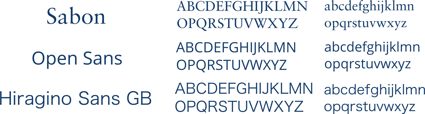
Fonts
Making Images with Inkscape