Difference between revisions of "Team:Cambridge-JIC/Wiki Design"
Simonhkswan (Talk | contribs) |
Simonhkswan (Talk | contribs) |
||
| Line 82: | Line 82: | ||
<img src="//2015.igem.org/wiki/images/e/ea/CamJIC-SiteMap.png" style="width:90%"> | <img src="//2015.igem.org/wiki/images/e/ea/CamJIC-SiteMap.png" style="width:90%"> | ||
</center> | </center> | ||
| − | |||
<br> | <br> | ||
<p> By structuring the website as a 2 layer deep hierarchy, users can travel through our wiki to get an overall idea ang go indepth on anything that catches their eye. Of course, they are also free to teleport to any page with the menu bar above. Finally, our downloads page contain all the possible downloads found throughout the website for ease of access.</p> | <p> By structuring the website as a 2 layer deep hierarchy, users can travel through our wiki to get an overall idea ang go indepth on anything that catches their eye. Of course, they are also free to teleport to any page with the menu bar above. Finally, our downloads page contain all the possible downloads found throughout the website for ease of access.</p> | ||
| − | |||
<center> | <center> | ||
| − | <p>Happy | + | <p>Happy Navigating!</p> |
</center> | </center> | ||
Revision as of 21:24, 18 September 2015
Graphic Design
Colours
Before creating too many images and colouring in your wiki, deciding on a colour scheme can ensure your wiki looks professional.
Colours in HTML are given as RGB values. These can be difficult to visualise and match. Instead pick your colours first with HSL (hue, saturation and lightness) values. As a guide, three to four different hues is easy to work with.

- We used four different hues that were all cool colours.
- Each hue then had two or three shades, made by changing the lightness and saturation.
- For backgrounds, avoid using highly saturated colours. None of the colours we chose were very saturated, this is to reduce the strain on viewers' eyes. This is why pastel palettes can be so visually pleasing.
- It's useful to have both dark (around 80/255 lightness) and light (around 220/250 lightness) colours when considering text on backgrounds. High contrast is needed to easily make out the features of words. Note also that fine details in bright blue can be hard to resolve with the human eye due to the lower abundance of S-cone receptor cells in the eye.
- Once you have picked a few colours then find their RGB values, ready to use for your website!
Fonts
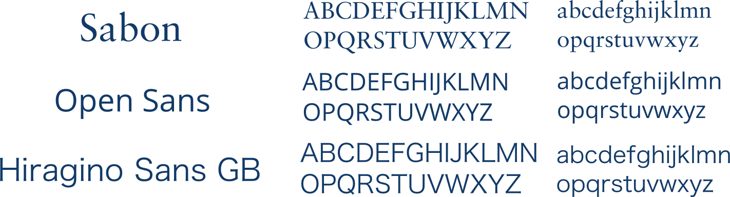
Unify your fonts across your webpage. Ideally, decide on one or to serif fonts and one or two sans-serif fonts. Serifs are the ticks on text that can make it easier to read, as letters are identified more easily. Our wiki uses three fonts: Sabon - a serif font, Open Sans, and Hiragino Sans GB.
When including fonts in style tags in your wiki, assign a family of fonts using font-family: font1, font2,... where font1, font2,... is the preferential order of similar fonts to be displayed in case a certain font isn't supported by the user's browser.
Making Images with Inkscape
Almost all of our images have been made on the program Inkscape. Inkscape is a free multi platform graphic designing software which is extremely easy to pick up and make graphics with. Three of our team learned the basics over night and created all of the back-panels of this website subsequently with it.
Check out Inkscape here.
User Experience
Navigation
Navigation is really important in an iGEM wiki. Users need to be guided through the website, with out losing the freedom to navigate quickly to any other location. Whereever you are in a team's wiki, having an impression of how much information is on the page, and on the other pages keeps the user from feeling lost.
Our approach to the navigation of our website involves two depth levels of information. The top menu bar contains the six different aspects of our project and going one by one through these allows for a brief overview of everything that we've done. Links to each of these pages are available from our home page. Each page has links to the deeper level of information, clicking on one of these from our home page gives you the details and specifics, including downloads and reports.
And the best part, at any point you can swap between the brief overviews and detailed information. Just click "learn more" for details.
By structuring the website as a 2 layer deep hierarchy, users can travel through our wiki to get an overall idea ang go indepth on anything that catches their eye. Of course, they are also free to teleport to any page with the menu bar above. Finally, our downloads page contain all the possible downloads found throughout the website for ease of access.
Happy Navigating!


